The existing golf club restaurant was rather stereotypical of a lot of golf club interiors in that it presented as a large, featureless, rather formal space with starched white tablecloths and dark furniture with traditional bar at one end. Even when occupied, its high ceilings and “view through” was not particularly welcoming.
Our brief was to create a personality for the restaurant area, whilst bringing in the lean-to conservatory, always boiling in summer and freezing in winter. The owners wanted to incorporate an informal brasserie as a “destination” with the aim of drawing and increasing lunchtime and evening meal trade as opposed to being reliant upon current club members only.
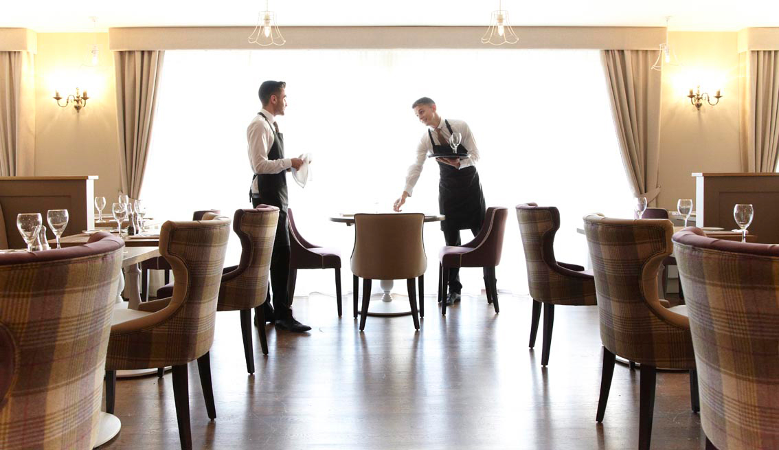
Our design created a more comfortable environment by simplifying the existing structure and controlling the flow of natural light through South facing windows.
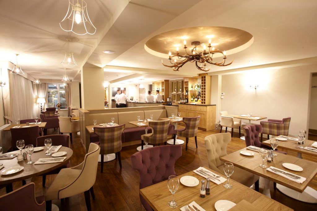
We replaced the glass and swag ceiling of the glass lean-to with plasterboard and some pendent lighting to add atmosphere; this in effect brought the seating in the lean to area into the main room and immediately solved the problems of temperature fluctuations. We also lowered the ceiling in the brasserie and visually broke the space by the introduction of a coffer.
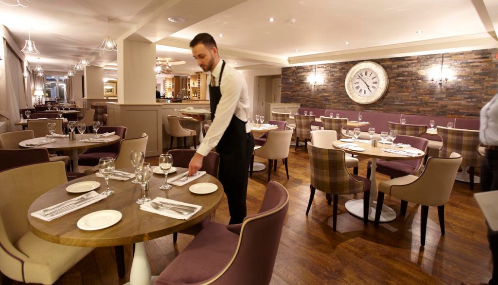
New banquets create smaller seating areas, typical of a brasserie and being less formal, much more inviting.
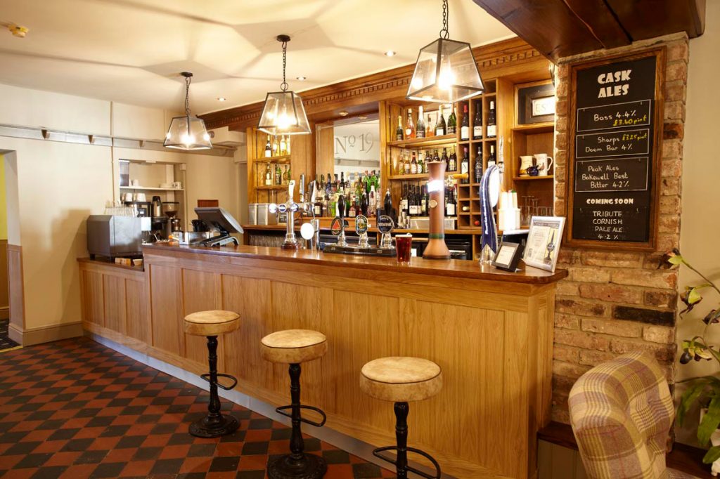
The bar area was simplified into a bar and back bar, creating a focal point whilst highlighting the splendour of a traditional mullioned window which was part of the original building.
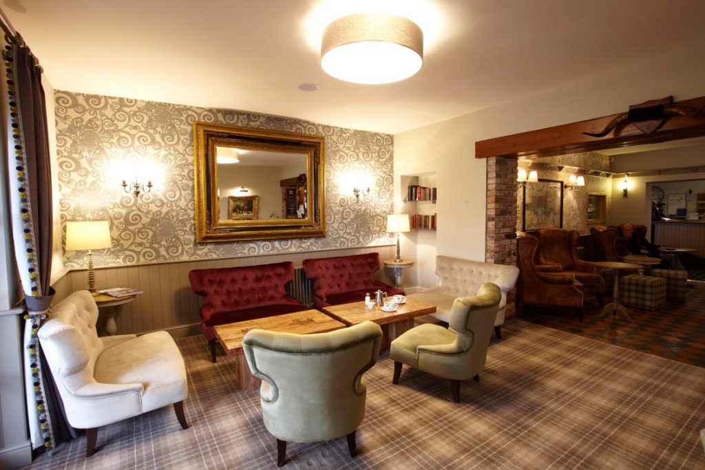
The overall theme is one of classic, rustic charm, which is continued through the three areas (brasserie, adjacent lounge and pub), but becomes slightly more formal as one enters the lounge. We used a mixture of hardwood veneers, painted finishes and quirky wall-coverings to give each space an individual personality.
In keeping with its golfing heritage, fabrics used on seating were a mixture of natural hardwearing English wools and tweeds.
Lighting was key part of this project using a mix of different styles – wall and pendant – and the antler chandelier designed as a talking point.
All images supplied and reproduced here by kind permission of Horsley Lodge.
