The setting of The Hertsmere course and clubhouse are amazing and exceptionally beautiful. The golf course and the driving range have real character and are of a high quality, which we wanted to capture and reflect in our designs.
The clubhouse is quite literally that, a place for everyone to meet and socialise and talk over their game with friends, families and children. With the Script Restaurant and Bar, we wanted to add a bit of a ‘wow’ factor to help match the exceptionally high standards of the rest of The Hertsmere.”
The final design draws on the importance of landscape, countryside and environmental sustainability, without detracting from the view of the course.
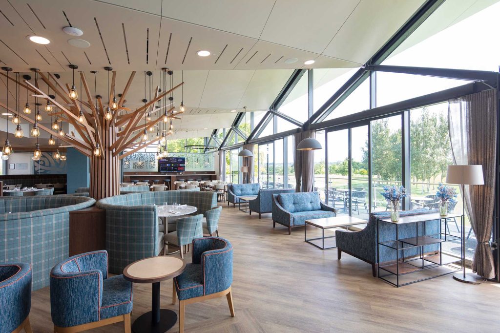
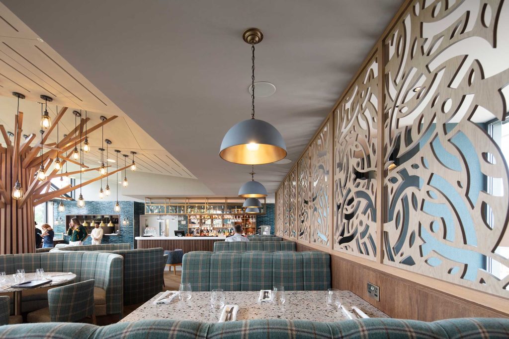
Whilst the new look of the interior is one that has been very carefully considered with contemporary lighting and seating, we didn’t want it to overpower the positive details of the building, including the views out over the golf course.
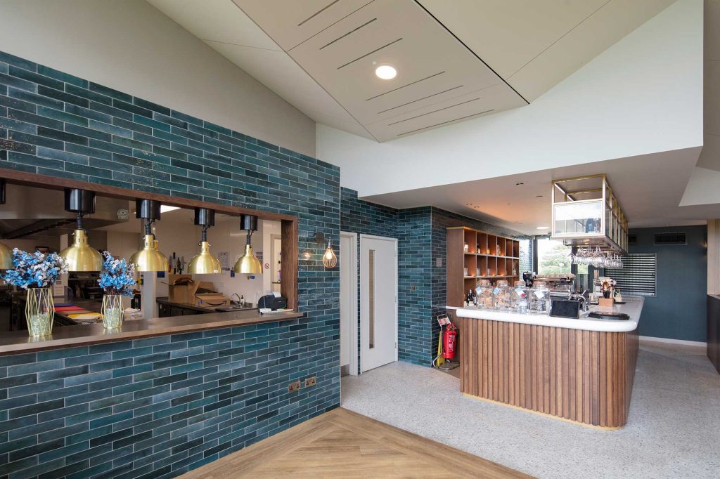
A dominating sloped timber ceiling has now been painted over and a flattened bulkhead area created on the ceiling helps to break up the room into zones.
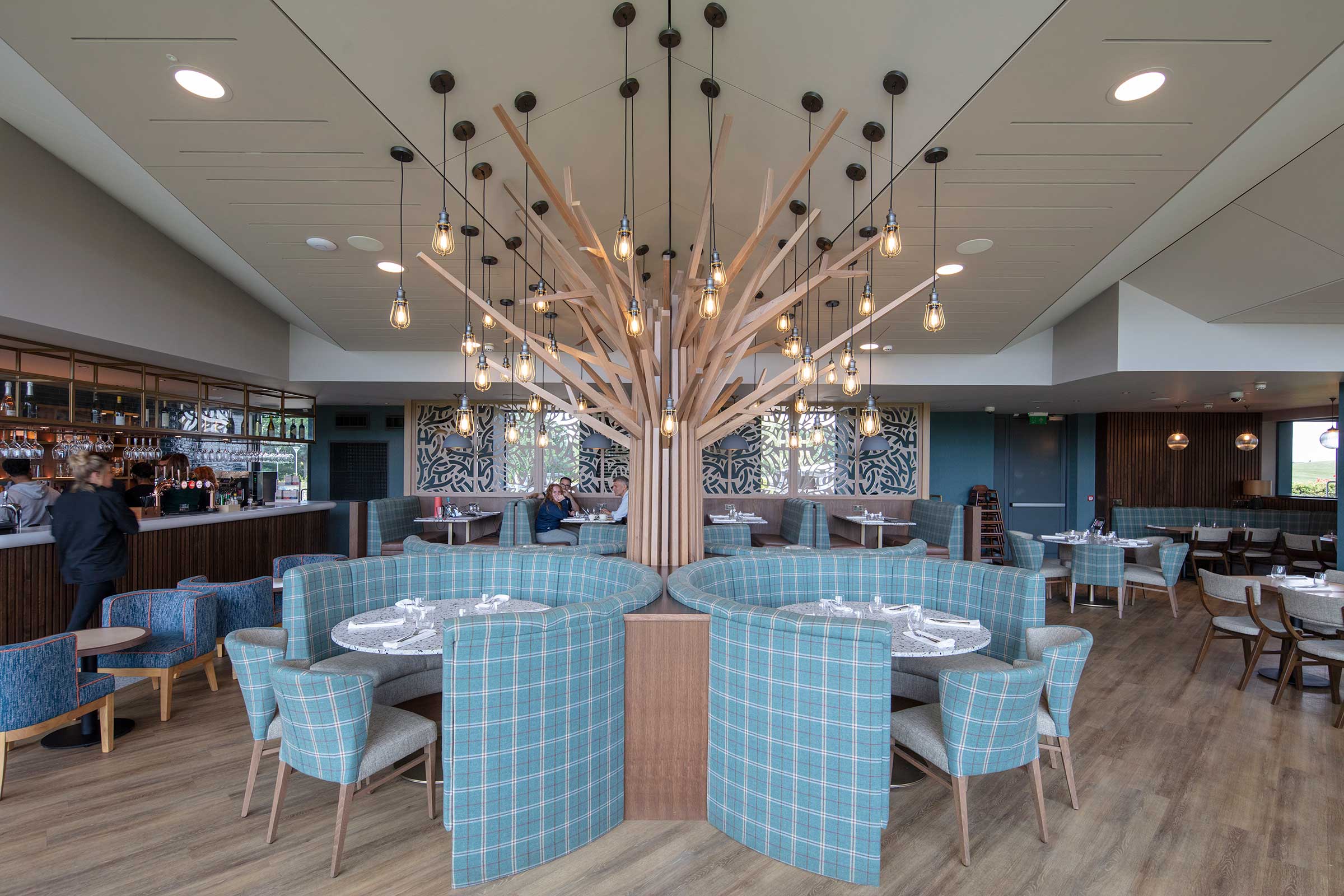
A custom bespoke tree-like structure forms a new centrepiece to the room and is constructed from solid oak, and set with lights randomly to break up the mass of ceiling.
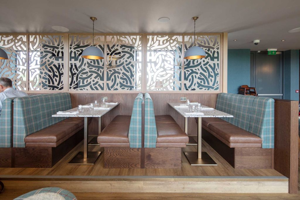
An innovative, subtle tiered effect seating system has created booths on a raised deck at the rear where people can look across the curved dining booths by the central tree-form which in turn looks over the lower sofa-type seating at the front window. This was all done to ensure uninterrupted views of the course.
A mix of timber seating and upholstered booths separated by fret-cut screens break up the room further to create the sense of different areas within one larger space. The fret-cut detailing is also applied to the glazing using The Hertsmere logo, which must be one of the best known in the world of golf.
The colour palette is one of subtle tones with punches of colour based on The Hertsmere’s branding.
